
RR
Branding Philosophy
VOL. 2026.04Heritage Verified
Identity Registry Protocol
Architecture
Of Prestige.
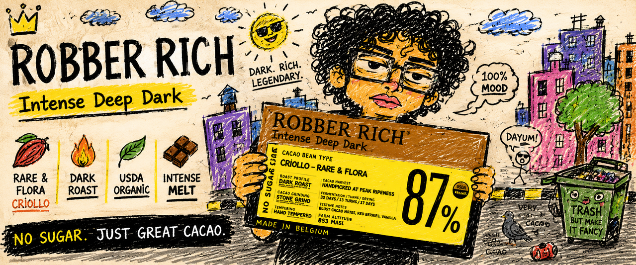
A heritage-driven chocolate identity built on timeless design, emotional depth, and structured European-inspired aesthetics. Robber Rich transforms chocolate into an editorial luxury experience where typography, texture, storytelling, and emotional memory work together to create permanence beyond trends.
Audit 01
The Power
Of Serif.
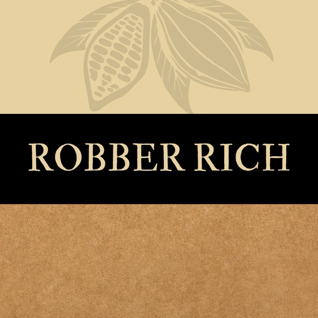
The Robber Rich logo uses a high-contrast serif structure to establish timeless authority. Instead of chasing minimal trend systems, the typography positions the brand closer to European editorial houses, luxury ateliers, and heritage product architecture.
Audit 02
Kraft
Psychology.
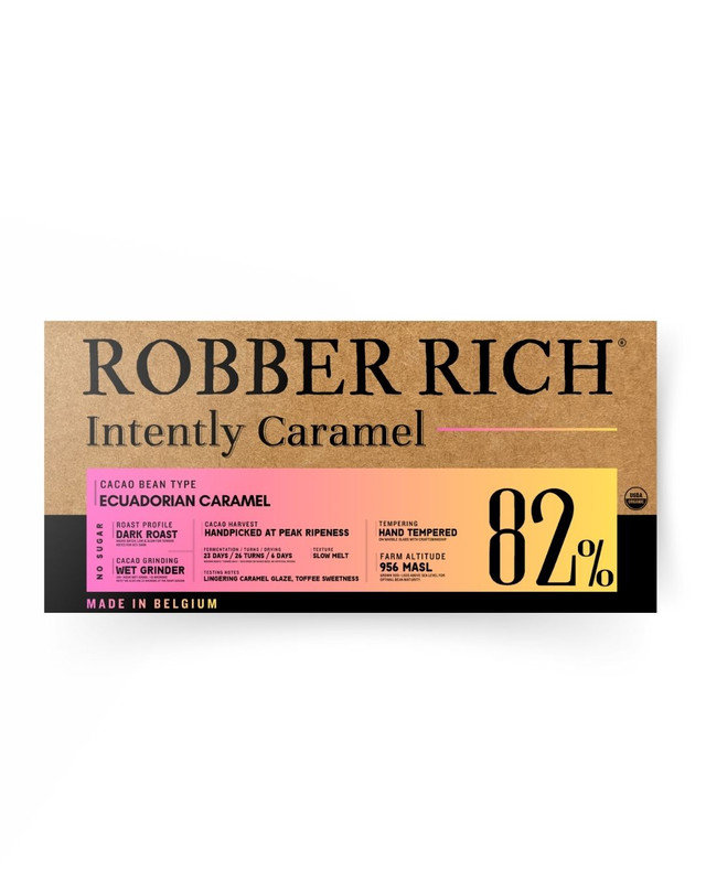
The kraft texture represents honesty, warmth, earth, and raw cacao authenticity. Instead of metallic over-luxury, Robber Rich embraces tactile emotion and artisan imperfection — making the packaging feel human, collectible, and emotionally grounded.
Audit 03
Transparency
As Luxury.
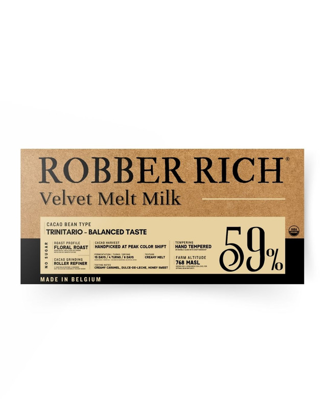
Technical information is intentionally highlighted across the packaging. Fermentation cycles, roast details, cacao genetics, and sourcing narratives become part of the emotional storytelling system — transforming transparency itself into a premium luxury signal.
Motion Narrative
Brand Cinema.
I. The 125H Protocol
Atelier FilmII. Heritage Encasement
Operational FilmBranding As
Legacy.
“It is not trend-based. It is system-based. From a grandmother’s kitchen to a global luxury standard — Robber Rich is designed to feel emotional, permanent, and unforgettable.”